Monday, 16 November 2015
Style/Iconography
Fonts
Here are some fonts I have found on DaFont.com that I think would work well within my magazine. I decided i would like to use a thick, solid font for my magazine as this would attract viewers to the magazine. To make my magazine unique I could use photoshop to experiment with different coloured fonts for my magazine.
Colour Schemes
Images
Here are some images from existing magazine Fader that I am considering to base my front cover images on. Although these images feature artists from the genre of rap, i am looking to capture images of indie artists to correspond with the genre of my music magazine. To capture images in this style i will be looking to photograph my chosen subject against a backdrop.
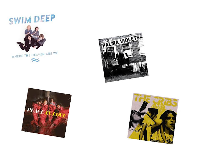
Here are some album covers from bands of the genre my magazine will be based, with different styles of photographs i could use in my magazine. The photographs of Swim Deep or Palma Violets are the photographs I am considering basing my magazine on. I particularly like the Swim Deep album cover as the image is taken from a very odd angle, I think this reflects the obscure personality of the band, and by following this idea I could show that my magazine has a taste for the same sort of weirdness. The Palma Violets album cover is another good photograph as it is taken in a real setting, reflecting the working class background the band has, by taking my photographs in a similar setting, I would appeal to the working class audience of my magazine.
Subscribe to:
Post Comments (Atom)


No comments:
Post a Comment