Friday, 22 April 2016
Evaluation Question 6
6) What have you learnt about technologies from the process of constructing this product?
Whilst constructing my product I have developed skills in many areas regarding technology. I have used many different programs and websites to help me achieve a professional look for my media product, including Adobe Photoshop, blogger, and Prezi. Photoshop allowed me to edit and create my product, and through using it I have acquired knowledge on how to crop images, edit them, create typical conventions of a magazine etc. With this knowledge I was able to create a final product that looked professional.
Prezi allowed me to present information in an organised and aesthetically pleasing way, helping me plan my final product more thoroughly, and leading to a more professional well thought out final product in the end.
Blogger has allowed me to post and keep track of all my work and plans throughout the project, and enabled me to display my product in a stylized way which is very useful when constructing a product.
Evaluation Question 5
5) How did you attract/address your audience?
I began by thinking of what audience I was looking to address. Because of the genre of my magazine I decided it would only be right to address people who are seen or see themselves as 'Indie'. To attract and address Indie people I made sure all the content in my magazine was related to the interests a typical Indie person may have, for example, all the feature stories are based around bands and artists that are considered 'Indie' and are associated with Indie music culture. I also made sure to address my audience with content that would interest them, for example people with an interest for Indie music won't be looking to find out about the latest pop artists, they will be looking for content my magazine shows, next big Indie bands, news relating to big names in the scene, reviews of bands and live shows they should attend.
Evaluation Question 4
4) Who would be the audience for my media product?
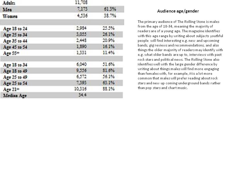
From the offset I decided my magazine's genre would be indie rock, and following this came the thought of who this would interest and attract. The audience for indie rock music is quite a niche audience so i bared this in mind. I also looked at the reader profile of indie music magazine NME to analyse their audience, which will be of a similar nature to the audience of my media product.
I found the primary audience was males, with only 32% of the audience being female.
I found the average age of the reader was 24.
And I also found their are 2 cluster groups of consumers of NME: Young socialites who are style conscious students typically who love music, and first time earners who are people with a job who are simply in love with indie music.
With this in mind I made sure all my content, aesthetic, offers and images all were something this audience would appreciate and pay an interest to.
Evaluation Question 3
3) What kind of media institution might distribute your media product and why?
My magazine is an indie rock magazine, meaning I would have to find an institution that distributes magazines of a similar genre, as they would know exactly how and where to distribute my magazine in order to gain an audience. An example would be the institution IPC, who distribute NME, by also distributing my magazine, IPC will know how to attract an audience and gain profit from my product.
On the contrary, an institution that doesn't distribute magazines of a similar genre would also be a good idea as they're would be no competition between sales, and the institution wouldn't doubt the idea of two magazines with very similar content being distributed at the same time by the same institution. An example would be Bauer who distribute Q, a magazine that mainly focuses on mainstream rock and roll, by having an indie music magazine they will have a broader range of magazines, which will potentially gain them profit.
Evaluation Question 2
2) How does your media product represent particular social groups?
My media product has a specific target audience; consumers of Indie music. By identifying this target audience from the offset I found ways to easily represent the specific social group associated with my media product; Indie people. My reader profile is shown in the image below. The content of my media product represents this social group as it is all focused around artists, bands and news that will interest people who are interested in Indie music. For example, Alex Turner is a popular cultural icon among those who are interested in Indie music, therefore by including content around him my media product represents the same interests to those it is aimed at. I also included the offer of tickets to Leeds festival in the plug, this represents the social class of my magazine, as many readers will be interested in the festival because of the Indie music acts, but may not be able to afford full price tickets. I also represented social class through the affordable price of my magazine as people of a working class background will have no problem paying a cheap price for a lot of content.
Evaluation Question 1
Evaluation Questions
1) In what ways does your media product use, develop or challenge forms and conventions of real media products?
To ensure my media product was made to a professional standard I used as many of the typical conventions as possible.
On my front cover I included:
- A masthead, as it is an essential convention at the top of the magazine to ensure the reader knows what the magazine they are consuming is called
- A plug to offer readers an opportunity that will attract them and make them want to consume my product, the plug contains an offer that corresponds with the genre of the magazine, in my case it is tickets to Leeds festival, a festival that displays acts from the genre of my magazine, Indie music.
- A feature story, which displays the main content from the magazine and encapsulates the story into a bold, brief piece of text, leaving the reader wanting to know more.
- Cover lines, which offer the name of artists that are featured in the magazine, offering more content for the reader to be interested in.
- Images, main and small, to showcase the artists involved with the magazine and attract the reader before even reading what is to be said, if they are interested in the artists they will be interested in the product.
On my contents page I included
- Main feature story, to offer a more detailed insight into the content associated with the main artist
- Page numbers and feature stories, to direct the reader to any of the stories they want to read instantly and give them a brief summary of the content written about that artist.
- Subscription opportunity, to ensure readers are given the opportunity to invest into the product for a cheaper rate, ensuring the magazine gains a committed audience.
- Letter from the editor, to give the magazine a professional look let the audience engage with the man behind the magazine.
- Images, to catch the eye of readers who may be browsing the contents to make a decision on buying the product
On my double page spread I included
- Large image, as this is a typical convention of double page spreads and helps maintain a professional feel to my magazine.
- Pull quotes, to give the audience a brief summary of the article, gaining their interest.
- Main Story, In a column structure, making the text look more concise assuring anyone who may think a main feature story is too much to read invests time into the main story.
Monday, 11 January 2016
Monday, 4 January 2016
Front Cover Draft
Self Assessment
- Reconsider color scheme
- Reconsider/develop font choices
- Add more conventions to acquire a professional look
Wednesday, 25 November 2015
Tuesday, 17 November 2015
Costume Design
This first costume design has a skater like feel to it, something which I have seen become quite popular with new, upcoming indie bands of today. This look along with a t shirt of a well known classic indie rock band will be a great look for my front cover model as it will look as though they really are quite unknown, making my magazine look more professional
This second costume design has a classic underlying indie feel to it with a modern twist. The denim jacket and white t-shirt combination is a classic good looking indie male look, by accompanying this with ripped jeans, glasses and Chelsea boots (modern indie fashion items), my front cover model will look like a typical indie music artist, which will certainly indicate what genre of music my magazine is based upon, engaging people with an interest in said genre just from looking at my model
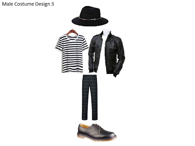
My third costume design is made of quite obscure fashion items, with classic indie fashion items. The checkered pants and striped t-shirt suggest a careless kind of attitude with a taste for obscure fashion, something a lot of front men of indie bands of the time seem to possess. The denim jacket, doc martens and Pete Doherty like hat suggests a typical indie attire, and a knowledge of what icons in the genre wear, making the model look like he is of an indie music background, which will appeal to my target audience.
My first female costume design takes inspiration from lead signer of Wolf Alice; Ellie Rowsell. The look is quite a grunge look because of the ripped tights and pastel colored dress, with elements of modern day indie fashion with the Dr Martens and leather jacket, combined this makes for a look that is becoming quite popular with female indie musicians.
My second female costume design is another experimental look that takes inspiration from the grunge-like side of indie music today. The classy looking shoes and top combined with the ripped tights and frayed denim shorts is a juxtaposition that many indie artists look to achieve. With my magazines audience mainly being men, the quite revealing look will tend to attract more viewers, this has been demonstrated through many a magazine, or any other media product, with a female on the cover many a time before.
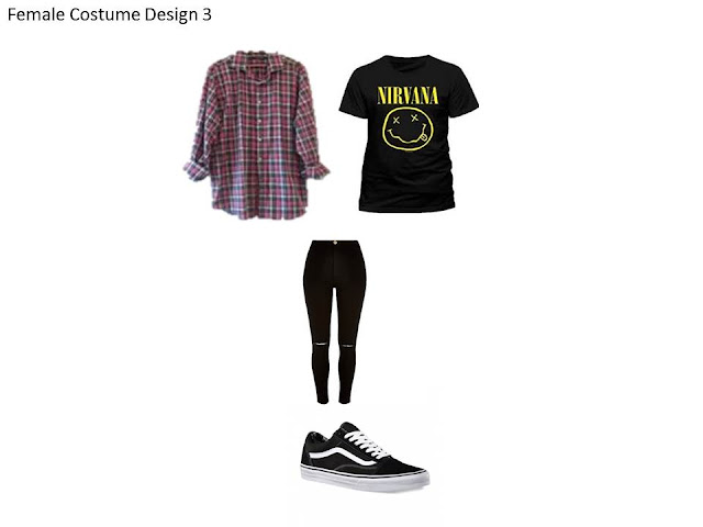
My third female costume design is a more casual modern day look, combining stereotypical male fashion items with a female model. The Vans shoes and band t-shirt/flannel shirt combination is something you would find on many a male indie music artist. combined with the female jeans and female model, the look will indicate that my model is not as feminine as one would assume, which is something a lot of indie girls seem to identify with; breaking the boundaries set by gender specific fashion items.
Monday, 16 November 2015
Style/Iconography
Fonts
Here are some fonts I have found on DaFont.com that I think would work well within my magazine. I decided i would like to use a thick, solid font for my magazine as this would attract viewers to the magazine. To make my magazine unique I could use photoshop to experiment with different coloured fonts for my magazine.
Colour Schemes
Images
Here are some images from existing magazine Fader that I am considering to base my front cover images on. Although these images feature artists from the genre of rap, i am looking to capture images of indie artists to correspond with the genre of my music magazine. To capture images in this style i will be looking to photograph my chosen subject against a backdrop.
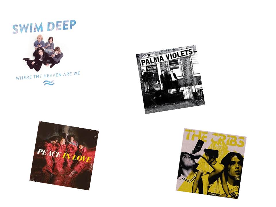
Here are some album covers from bands of the genre my magazine will be based, with different styles of photographs i could use in my magazine. The photographs of Swim Deep or Palma Violets are the photographs I am considering basing my magazine on. I particularly like the Swim Deep album cover as the image is taken from a very odd angle, I think this reflects the obscure personality of the band, and by following this idea I could show that my magazine has a taste for the same sort of weirdness. The Palma Violets album cover is another good photograph as it is taken in a real setting, reflecting the working class background the band has, by taking my photographs in a similar setting, I would appeal to the working class audience of my magazine.
Monday, 2 November 2015
Social Demographics
It is important for institutions to understand the demographics of their product, as the demographics are what show exactly what the target audience is, which helps the magazine directly appeal with them through the content, price, and design of their product.
Social Class of my magazine
My magazine will be aimed towards people of a working/middle social class, I have chosen this social class as it is the most common social class associated with indie music, this social class will be more likely to invest in my magazine, compared to someone of a higher social class.
Price of my magazine
The price of my magazine will be £1.50, i have chosen this price as it is relatively cheap, making it attractive to my target audience, having an expensive magazine aimed towards a working/middle class audience simply wouldn't work.
Distribution of my magazine
My magazine will be weekly, I have chosen to have a weekly magazine as I think this would appeal well to my target audience, having a magazine with a short amount of content, new news every week is something those with not enough time to invest in finding new things in their favorite music genre would be essential.
Giveaways of my magazine
My magazine would contain free gifts and prizes such as posters, CD's and concert tickets, these products would appeal to my target social class as they are products that might not be easily accessible by those with a low disposable income.
How the social class table has helped me find a target audience
By choosing my audience within reference to individual social aspects related to the genre of my magazine, the content of common conventions such as data and issue, price and the plug are already decided to appeal to my target audience.
Saturday, 24 October 2015
Friday, 23 October 2015
Tuesday, 29 September 2015
Preliminary Task Evaluation
What have you learned from completing this task?
By completing my preliminary task i have learned and understood the different types of media text, the numerous conventions used in a magazine and how to use them effectively, and how to use technology to successfully design a magazine. From the preliminary task i now feel i have the right knowledge and experience to successfully complete the main task to a high standard.
How have you used technology?
I have used Adobe Photoshop to design a music magazine to a professional standard. By using and getting used to software used by professionals I feel equipped to make my main task look as professional as a real music magazine. I have also used the internet to help me gather and analyse various music magazine related images and examples, which in turn has helped me fully understand the procedure that goes into making a music magazine, and the unwritten rules I should follow.
What conventions have you used and why?
I have followed all the typical conventions of a mainstream music magazine by including a masthead, feature stories, a plug and a main image. By doing so with my magazine I have enabled it to stand to a professional standard with the information included, making my magazine contain all the conventions mainstream music magazines include to attract viewers and entertain them.
Monday, 28 September 2015
Main Brief
To design a front cover, contents and double page spread of
a new music magazine. All images and text used must be original; a minimum of
four images must be used.
Wednesday, 23 September 2015
Photographs For Front Cover
These are the 10 photographs i had in mind to potentially be the front cover of my college magazine, what made me choose the image i did for the front cover was my subjects facial expression, stance and use of the props i provided. The facial expression of the subject suggests that he is happy to be a student which is exactly what i required. He is stood in a very professional way which is a great feature for my main image, and the props are clearly seen in the image which is precisely what i desired for my main image.
| Chosen Main Image |
Subscribe to:
Posts (Atom)